b3ta.com board
You are not logged in. Login or Signup
Home » Messageboard » The Cat Survival Trust - Logo Challenge » Message 10329710

[challenge entry] 1, 2, 3 or 4?
1. 2.
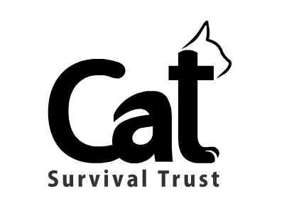
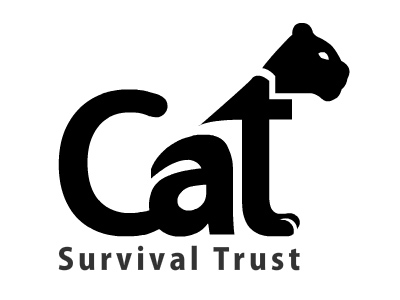
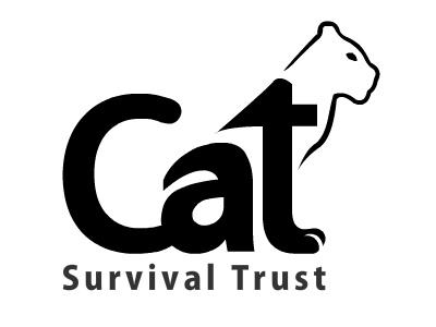
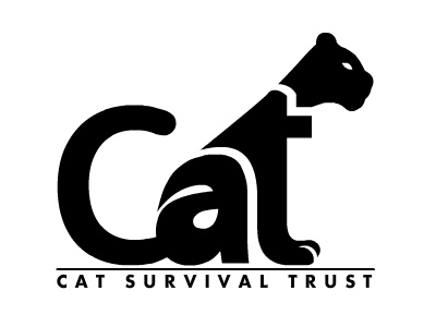
3. 4.

From the The Cat Survival Trust - Logo Challenge challenge. See all 115 entries (closed)

(, Tue 8 Feb 2011, 13:27, archived)
# Ooh you clever sausage you!
*Click* :)
(, Tue 8 Feb 2011, 13:29, archived)
# haha
ta sir :)
(, Tue 8 Feb 2011, 13:30, archived)
# *Likes very much*
Needs a tiny bit less 'domestic cat' though I feel
(, Tue 8 Feb 2011, 13:32, archived)
# Yeah, I know what you mean
I'll see what I can do boss ;)
(, Tue 8 Feb 2011, 13:38, archived)
# :D
Now even more ace!
(, Tue 8 Feb 2011, 14:46, archived)
# and we have a winner!

EDIT: I love the second one!
(, Tue 8 Feb 2011, 13:40, archived)
# Second's my fav too
;)
(, Tue 8 Feb 2011, 17:15, archived)
# I like this.
I shall therefore click *I like this*
(, Tue 8 Feb 2011, 13:44, archived)
# Thanks JPG
I therefore clicked "Reply" ;)
(, Tue 8 Feb 2011, 17:46, archived)
# I like this
(, Tue 8 Feb 2011, 13:54, archived)
# Cheers P69 :D
(, Tue 8 Feb 2011, 17:47, archived)
# nice one.
there are a few that looks like domestic cats in the compo, which could lead to come confusion.

but the composition of your one is very clever.
(, Tue 8 Feb 2011, 13:54, archived)
# Thanks Thor
:)
(, Tue 8 Feb 2011, 17:48, archived)
# Splendid
Number 2or3 works much better.

I like the solidness of number 2

But then i like the swish of number 3

But which one is best, there's only one way to find out...


...cat fight!

On reflection, number 3 is the better, in my honest opinion.
(, Tue 8 Feb 2011, 22:10, archived)
# He's a bit good isn't he everyone?
very nice squire
(, Tue 8 Feb 2011, 13:55, archived)
# haha
cheers B4
(, Tue 8 Feb 2011, 15:20, archived)
# That's fricking ace!
*clcik*
(, Tue 8 Feb 2011, 14:02, archived)
# Smoke me a kipper!
ta!
(, Tue 8 Feb 2011, 17:15, archived)
# now you're just showing off
(, Tue 8 Feb 2011, 14:20, archived)
# heehee
I'll quit now, sorry...
(, Tue 8 Feb 2011, 17:16, archived)
# i love 'em
number 3 for me, or still number 1 from your other hands down winning entry.

edit/actually make that number 4 or 3 or 4 or 3 nah 4
(, Thu 10 Feb 2011, 16:24, archived)
# very nice
(, Tue 8 Feb 2011, 14:37, archived)
# Thank you :)
(, Tue 8 Feb 2011, 17:17, archived)
# That's really good!
(, Tue 8 Feb 2011, 14:51, archived)
# Cheers Barbs
Do you have a favourite among them?
(, Tue 8 Feb 2011, 17:20, archived)
# Win!
*cerleeeeek*
(, Tue 8 Feb 2011, 14:59, archived)
# Yaaay!
(, Tue 8 Feb 2011, 17:19, archived)
# I like this because it's simple and effective which sells the logo purrrrfectly*
*click*
(, Tue 8 Feb 2011, 15:40, archived)
# Thank you Maiden
:)
(, Tue 8 Feb 2011, 17:12, archived)
# i vote this to win
(, Tue 8 Feb 2011, 16:31, archived)
# Cheers Boss!
(, Tue 8 Feb 2011, 17:14, archived)
# Definately No2 (the black panther one - incase you change them again)
The only CST post to get a click from me.......so far!

Edit. Might be worth joining the a to the t (as the c is joined to the a )
(, Tue 8 Feb 2011, 17:20, archived)
# Woah, a high honour
No more changing, the Black panther one is my own favourite, cheers.
(, Tue 8 Feb 2011, 17:21, archived)
# Number 3
because in number 2 the whole thing seems off-balance to the right, and also when the head is black I slightly want to try and read it as a fourth letter, which only leads to disappointment. Besides, a panther isn't really a thing, it's just a melanistic leopard, cougar or jaguar, which is why they're not on the list at the CST site.
(, Tue 8 Feb 2011, 22:05, archived)
# This
It's a bit funny though as cats only curl their tales like that when they poo.
(, Wed 9 Feb 2011, 20:53, archived)
# Second one is perfect.
(, Tue 8 Feb 2011, 22:11, archived)
# I really
like the "t"s of the latter two, but prefer the slightly more domestivated head of the first.
An amalgam of those ideas would be my favourite.
(, Wed 9 Feb 2011, 0:14, archived)
# lovely stuff
#2 for me!
(, Thu 10 Feb 2011, 9:30, archived)