Home » Messageboard »
New Logos For Old » Message 8111469
From the
New Logos For Old challenge. See all
549 entries (closed)
(
bilbobarneybobs I'll be 14 in b3ta years soon. ,
Thu 28 Feb 2008, 10:37,
archived )
hahaha
splendidly done.
(
Thor_sonofodin has done things, terrible things on ,
Thu 28 Feb 2008, 10:38,
archived )
Ha ha, it's funny 'cos it's virtually true!
(
An Eagle in Your Mind ,
Thu 28 Feb 2008, 10:38,
archived )
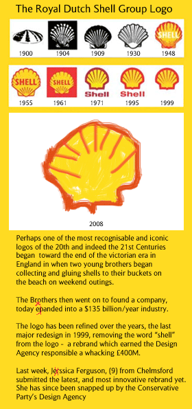
I like this new logo
it has a certain innocence and hope for the future, which perfectly reflects Shell's brand values
(
Mighty Nibus who dares gins | @nibus ,
Thu 28 Feb 2008, 10:39,
archived )
but where's the raping of third world countries of the exploration of the alaskan oil fields?
(
Thor_sonofodin has done things, terrible things on ,
Thu 28 Feb 2008, 10:43,
archived )
I feel the rough edges
symbolise Shell's no-nonsense approach
(
Mighty Nibus who dares gins | @nibus ,
Thu 28 Feb 2008, 10:44,
archived )
Not to mention being terribly witty and ironic.
(
Je suis un vagabond is an unfunny, up your own arse middle class knob ,
Thu 28 Feb 2008, 10:44,
archived )
pffft
nice one bruvepanded, Jerssica
(
Aphex The Mink Snackless ,
Thu 28 Feb 2008, 10:41,
archived )
oops
(
bilbobarneybobs I'll be 14 in b3ta years soon. ,
Thu 28 Feb 2008, 10:48,
archived )
pedantic swine ain't i?
(
Aphex The Mink Snackless ,
Thu 28 Feb 2008, 10:48,
archived )
Hehehehe
(
mediocre ha ha ha, you're reading this ,
Thu 28 Feb 2008, 10:43,
archived )
How do Bilbo!
Corking! Is that true about the £400m?? *If so, faints melodramatically*
(
Ninj ,
Thu 28 Feb 2008, 10:45,
archived )
Ning Ninj
probably not, but the true figure would have paid off your mortgage and then some, I imagine
(
bilbobarneybobs I'll be 14 in b3ta years soon. ,
Thu 28 Feb 2008, 10:48,
archived )
You're not wrong mate!
We do logo designs and the cost gets argued over for ages.
(
Ninj ,
Thu 28 Feb 2008, 10:58,
archived )
splendid.
(
god save the queen making another unremarkable comeback ,
Thu 28 Feb 2008, 10:49,
archived )
Hide
Hide post If you want to unhide this post later, click the "update profile" link in the top navigation bar, and scroll down to the bottom.
Ignore
Shush them a week You will be blisfully unaware of this user for just one week
Mute user You will not see this users messages again
Block user You will not see them and they will not see you
