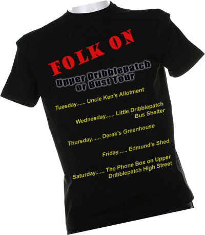
Any quick hints on how to make t-shirt lettering a bit more realistic gratefully received.
You could try using some layer blending modes to try and give a tiny hint of texture under the lettering.
(I only learnt the 'multiply' layer blending thing last night and it's already let me down.
(and maybe fuck around with the skew/transform/perspective type controls - to break up the linear.
not an easy thing to make look natural tho
(not an easy thing to make look natural tho
I tried both of those too.
Make them less opaque - helped.
Mess about with warp/perspective - 'mess' is the right word.
(Make them less opaque - helped.
Mess about with warp/perspective - 'mess' is the right word.
I duplicated you teashirt three times....
Made the bottom layer compleatly black...
turned the top two layers into lighten....
then moved the text with liquify.... hit both layers with dodge, burn, blur and sharpen and then adjusted opasity....
as i said two minutes work only but you gat the idea...

(,
Fri 19 Aug 2011, 16:23,
archived)
Made the bottom layer compleatly black...
turned the top two layers into lighten....
then moved the text with liquify.... hit both layers with dodge, burn, blur and sharpen and then adjusted opasity....
as i said two minutes work only but you gat the idea...
Good idea. (I don't know what dodge is but I'll give it a shot)
Thanks that man - wherever you are.
Edit - silly me. Dodge is the opposite of burn. duh!
(Thanks that man - wherever you are.
Edit - silly me. Dodge is the opposite of burn. duh!
It lightens things... instead of darkening things....
So in you use it like a zebra pattern in a diagnall across the picture in conjuction with dignall liquify going up and down, in should look a little like bumps and dips in the fabric making it look a little more three dimensionall....
Edits.... you edited as I was replying...!! hahaha ;-)
Double edits... I hoped you marvelled at my spelling as I typed in a hurry.. !!!
(,
Fri 19 Aug 2011, 16:51,
archived)
So in you use it like a zebra pattern in a diagnall across the picture in conjuction with dignall liquify going up and down, in should look a little like bumps and dips in the fabric making it look a little more three dimensionall....
Edits.... you edited as I was replying...!! hahaha ;-)
Double edits... I hoped you marvelled at my spelling as I typed in a hurry.. !!!