Not 100% happy with this so I might drop the veins. The wings took forever too.
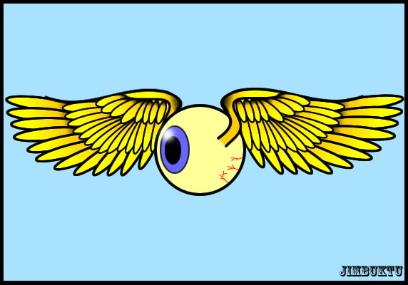
(I'd keep the veins, only have them set more randomly and maybe a lighter shade?
(And stupidly I just realised what I needed - what the rest of the pic has. stuck a radial gradient on it to black and it works LOADS better! Weird how it's not til you put something somewhere that you suddenly see what's wrong with it.
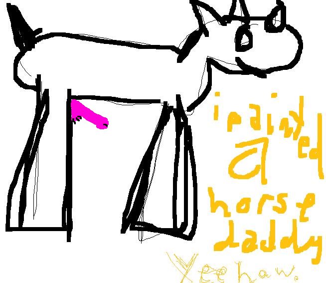
Edit: Oh, and thanks. :D
(Edit: Oh, and thanks. :D
Looking at you-oooo-ooou, I can read your mind...
www.lyricsfreak.com/a/alan+parsons+project/eye+in+the+sky_20005307.html
(www.lyricsfreak.com/a/alan+parsons+project/eye+in+the+sky_20005307.html
and thinking "That could do with more CDC."
(
ugly facebook wedding
(

I was just going to do one with a pie. :/ Mine would not have had a spiffing gentleman on though, so you win.
(Could I suggest angling the wings up a bit? Also, from a very technical-not-aesthetic point, the back wing should be shorter than the front if the eye is looking sideways. You can avoid this by making the eye look straight on.
(Not much, but that's the style I was playing with. I have a couple of pics with higher wings, but my do another one a bit higher. Cheers for the feedback! :D
(