Click for bigger (257 kb)
I'm really no good at this toap thing.
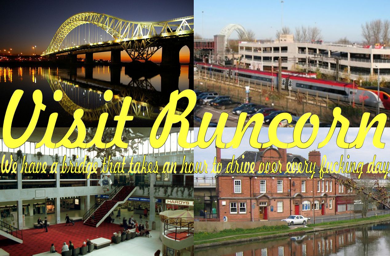
From the Fictional Tourist Brochures challenge. See all 98 entries (closed)
(
or is it irrelevant?
(It's even not clear in the CFB.....
I hate doing toap, my fonts and colours always looks cheap and nasty.
I need more fonts.
Oh and Runcorn is pretty much irrelevant... unless you like two pints of lager and a packet of crisps, And if that's the case you should be shot.
(I hate doing toap, my fonts and colours always looks cheap and nasty.
I need more fonts.
Oh and Runcorn is pretty much irrelevant... unless you like two pints of lager and a packet of crisps, And if that's the case you should be shot.
Having a mess around with any combination of drop shadow, inner and outer glow, inner shadow, bevel, eboss and stroke ect, will make them all nice and shiny and stand out :-)
(,
Sat 25 Aug 2012, 14:20,
archived)
The ones on the Runcorn side are plastic scousers.
(Hummus is better than skills as we keep getting reminded.
This seems an appropriate place to park this if you don't mind:

If you're using potatoshop the "stroke" option will give a quick border around your text.

(This seems an appropriate place to park this if you don't mind:
If you're using potatoshop the "stroke" option will give a quick border around your text.
I can't handle that level. I'd rather go to Wigan.
(looks very cosy...
(