Im doing my A level art piece based on the workings of Floria Sigismondi.
Basicly i had to cover my head in modrock and act like a mong. All with a broken wrist aswell
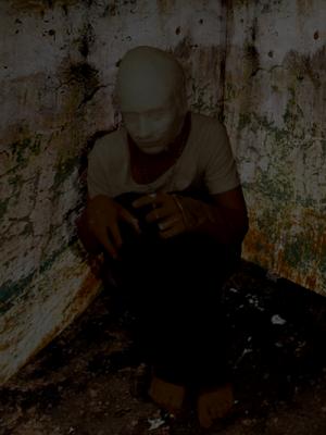
the background was photoshopped in
Click for bigger (175KB)
(,
Wed 1 Oct 2008, 14:35,
archived)
Basicly i had to cover my head in modrock and act like a mong. All with a broken wrist aswell
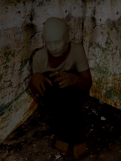
the background was photoshopped in
Click for bigger (175KB)
high 5 for same level art qualifications!
(can i join in with the hi-5s??
(the board's taken a bit of a dark turn in recent posts, hasn't it?
(it waxes and wanes
edit: lets have some fluff
(edit: lets have some fluff
I like this... though I think the darkness seems a bit too even... if that makes sense. Looks a bit like an adjustment layer.
(yeah modroc its like fibre covered in some sort of clay.
(,
Wed 1 Oct 2008, 14:43,
archived)
for darkness and contrast, try duplicating the layer, reducing the saturation of the duplicated layer to 0, and choose multiply from the blending menu.
Also, messing around the other blending possibilities can have pleasing results. Good luck.

Edit: I did some mucking around with it. A nice tool for differing the light is:
Make a white circle.
Cut the middle out of the circle.
Gaussian blur it a bit.
Soft light blending mode.
So it gives a kind of nice movable light.
(Also, messing around the other blending possibilities can have pleasing results. Good luck.
Edit: I did some mucking around with it. A nice tool for differing the light is:
Make a white circle.
Cut the middle out of the circle.
Gaussian blur it a bit.
Soft light blending mode.
So it gives a kind of nice movable light.
:(
(
I may as well just saturate the fuck out of it..

now i can see!!
(now i can see!!