Home » Messageboard »
Advertising in the Science Fiction Universe » Message 9932821(Thread )
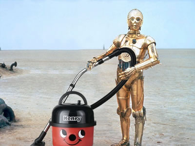
Etiquette demands I post a picture...
From the
Advertising in the Science Fiction Universe challenge. See all
492 entries (closed)
(
Barbarossa is not my real name ,
Wed 24 Feb 2010, 13:47,
archived )
So now I've got your attention, could someone please help me identify this font?
(
Barbarossa is not my real name ,
Wed 24 Feb 2010, 13:48,
archived )
what font?
(
Paul_P ,
Wed 24 Feb 2010, 13:50,
archived )
(
barryheadwound Mul-ti-pass? Multipass! ,
Wed 24 Feb 2010, 13:50,
archived )
you meany
you could try this:new.myfonts.com/WhatTheFont/
(
claptonista ,the idiot boy..........🫥 ,
Wed 24 Feb 2010, 13:52,
archived )
If I say you are, then you are
(
Barbarossa is not my real name ,
Wed 24 Feb 2010, 13:52,
archived )
I bet you haven't even clicked that link yet...
(
barryheadwound Mul-ti-pass? Multipass! ,
Wed 24 Feb 2010, 13:56,
archived )
Hahaha triple bluff!
git!
(
Barbarossa is not my real name ,
Wed 24 Feb 2010, 13:59,
archived )
\o/
(
barryheadwound Mul-ti-pass? Multipass! ,
Wed 24 Feb 2010, 14:04,
archived )
Don't they have algorythms for that sort of thing?
(
Colonel Santiago Introduced surprised kitty to the world. ,
Wed 24 Feb 2010, 13:51,
archived )
The algorithms have failed
(
Barbarossa is not my real name ,
Wed 24 Feb 2010, 13:51,
archived )
Shake up the bits and bytes until they get back in place. You could also try re-threading the big-O.
(
The Alchemist king of the needlessly complicated ,
Wed 24 Feb 2010, 13:55,
archived )
That sounds quite kinky
(
Barbarossa is not my real name ,
Wed 24 Feb 2010, 13:56,
archived )
Is there actually such a thing as a font matchin algorithms?
(
Colonel Santiago Introduced surprised kitty to the world. ,
Wed 24 Feb 2010, 13:58,
archived )
Haha
Yeah, new.myfonts.com/WhatTheFont/ tries to match on appearance, www.identifont.com/ tries to match by a process of elimination as you answer the questions.
(
Barbarossa is not my real name ,
Wed 24 Feb 2010, 14:01,
archived )
If you have, then that makes two of us..
..
(
Captain Howdy ,
Wed 24 Feb 2010, 14:01,
archived )
I don't see why there can't be.
If you can OCR some text, by matching the skeleton of each letter, then each font would have letter backbones with different deviations from some ideal.
(
The Alchemist king of the needlessly complicated ,
Wed 24 Feb 2010, 14:03,
archived )
give this a go
new.myfonts.com/WhatTheFont/
(
Griffin Saver Something, something, 2006, something. ,
Wed 24 Feb 2010, 13:51,
archived )
tried that :(
You'd think with an E like that it'd be easy to find. Maybe it's a custom one
(
Barbarossa is not my real name ,
Wed 24 Feb 2010, 13:51,
archived )
The "E" and the "F" match nicely. I like the slight bulge out on the "A", too.
(
The Alchemist king of the needlessly complicated ,
Wed 24 Feb 2010, 13:57,
archived )
Well this is all very interesting I'm sure, but it doesn't help me much.... :P
(
Barbarossa is not my real name ,
Wed 24 Feb 2010, 14:02,
archived )
Looks like something from the eurostile family
but I'm not sure
(
mediocre ha ha ha, you're reading this ,
Wed 24 Feb 2010, 14:11,
archived )
:D
(
Griffin Saver Something, something, 2006, something. ,
Wed 24 Feb 2010, 13:50,
archived )
Haha!
(
Barbarossa is not my real name ,
Wed 24 Feb 2010, 13:52,
archived )
3-2-1
(
glubglub should be working on ,
Wed 24 Feb 2010, 13:54,
archived )
phwoor!
(
Griffin Saver Something, something, 2006, something. ,
Wed 24 Feb 2010, 13:56,
archived )
Metal Mickey was cool... fact
Gimmie another thunderbuster grannie!
(
glubglub should be working on ,
Wed 24 Feb 2010, 14:00,
archived )
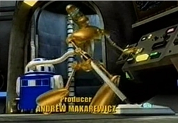
I knew I'd seen this somewhere before
ris - title sequence.
(
jflinden wifflewaffle ,
Wed 24 Feb 2010, 13:56,
archived )
Hide
Hide post If you want to unhide this post later, click the "update profile" link in the top navigation bar, and scroll down to the bottom.
Ignore
Shush them a week You will be blisfully unaware of this user for just one week
Mute user You will not see this users messages again
Block user You will not see them and they will not see you