Home » Messageboard »
XXX » Message 9630339
(Thread)
 vrrrp
vrrrp

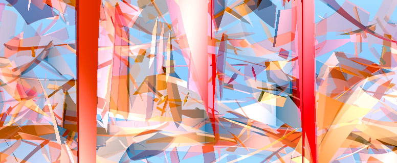
This is done by spinning lots of 3D boxes round and rendering each frame only 1 pixel wide, then joining all the lines together into a single picture.
there's someone who uses flash to make pictures like this
but I can't remember where his site is, let me know if you do!
(
 Bloop Fri 16 Jul, 22:10
,
Mon 10 Aug 2009, 14:52,
archived)
 Lovely job sir!
:)
(
 Ninj
Ninj,
Mon 10 Aug 2009, 14:53,
archived)
 Lovely stuff.
I don't understand a word of what comes after, but the visual effect is very nice.
(
 barryheadwound Mul-ti-pass? Multipass!
,
Mon 10 Aug 2009, 14:56,
archived)
 I've realised I did it wrong
so it's basically just all the frames of an animation shrnk and lined up
(
 Bloop Fri 16 Jul, 22:10
,
Mon 10 Aug 2009, 15:06,
archived)
 Hahahahahahahaha
hahahahahahahaha
(
 Barbarossa is not my real name
,
Mon 10 Aug 2009, 15:07,
archived)
 well my definition still applies
but it was a bit vague
edit: here is what it was meant to look like:....

(
 Bloop Fri 16 Jul, 22:10
,
Mon 10 Aug 2009, 15:10,
archived)
 Both are lovely!
(
 Barbarossa is not my real name
,
Mon 10 Aug 2009, 15:34,
archived)
 but I think I prefer this
(
 Bloop Fri 16 Jul, 22:10
,
Mon 10 Aug 2009, 15:08,
archived)
 :)
:)
(
 barryheadwound Mul-ti-pass? Multipass!
,
Mon 10 Aug 2009, 15:10,
archived)
 that's rather excellent, that is!
(
 theoriginalsteve <this space intentionally left blank>
,
Mon 10 Aug 2009, 14:57,
archived)
 Woo :D
Awesome :) and nicely done!
(
 xihpete A neutrino walks straight through a bar, with v>c.
,
Mon 10 Aug 2009, 15:01,
archived)
 awesome
Do you have a wallpaper sized version of something like this? :)
(
Peter_G,
Mon 10 Aug 2009, 15:04,
archived)
 not really
I can probably make one, what size do you want?
meanwhile, here;s the giant one from last night someone requested

click for huge 500k
(
 Bloop Fri 16 Jul, 22:10
,
Mon 10 Aug 2009, 15:08,
archived)
 That's cracking.
(
 zoldergoose
,
Mon 10 Aug 2009, 15:31,
archived)
 shattering, by the looks of it
(
 barryheadwound Mul-ti-pass? Multipass!
,
Mon 10 Aug 2009, 15:35,
archived)
 Nice!
Nice!
(
Peter_G,
Mon 10 Aug 2009, 15:39,
archived)
 whoa! got the resolution right.
it looks a bit hard to make sense of anything with that bg :D
(
 Bloop Fri 16 Jul, 22:10
,
Mon 10 Aug 2009, 15:57,
archived)
 nice
nice
reminds me of the artwork of magnetophone

(
 Le Snoet
,
Mon 10 Aug 2009, 15:15,
archived)
 nice
nice
looks like they have a better idea of when to stop adding more shapes.
(
 Bloop Fri 16 Jul, 22:10
,
Mon 10 Aug 2009, 15:22,
archived)
 apparently
the design was done by Martin Andersen, who then worked with the posh design firm V23.
(
 Le Snoet
,
Mon 10 Aug 2009, 15:27,
archived)
 cor!
cor!
(
 McBadger COW
,
Mon 10 Aug 2009, 15:18,
archived)
 I don't understand a word of what you just said
but I like it
(
 mediocre ha ha ha, you're reading this
,
Mon 10 Aug 2009, 15:28,
archived)
Hide
If you want to unhide this post later, click the "update profile" link in the top navigation bar, and scroll down to the bottom.
Ignore
You will be blisfully unaware of this user for just one week
You will not see this users messages again
You will not see them and they will not see you


