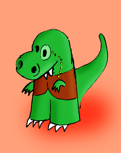
but the background lets it down. I'm sure that wasn't the point, but the second one has surrounding detail which adds the overall effect. but if i had to pick one, it'd be the first. Can I have another go and try and be even more long winded? I only ask because i'm quite bored at the moment and have nothing much to do...
(Ya WhatSkiddlyboop,
Mon 19 Aug 2013, 15:14,
archived)
You're right, the background has more detail
The idea would be to go back and add that to the first sketch style if I settle on that technique.
(gingerbenjiwrote a book http://goo.gl/8UiGjd,
Mon 19 Aug 2013, 15:29,
archived)
But the background of both pictures is just flat orange with an orange splotch.
(_Felix's school of dance and occult sciences,
Mon 19 Aug 2013, 15:32,
archived)
I interpreted his meaning as the shading on the dinosaur
The background itself is indeed identical
(gingerbenjiwrote a book http://goo.gl/8UiGjd,
Mon 19 Aug 2013, 15:42,
archived)
sorry, i confused matters somewhat
yeah, I meant the 'colouring in bit', the content within the outlines. this is what happens when I get bored, I make-a-no-sense...
the sketchier one, the first one. it has more movement.
(Ya WhatSkiddlyboop,
Mon 19 Aug 2013, 15:46,
archived)
Whew
I was afraid I was ruining a very subtle joke. YES THE DETAIL ON THE SECOND ORANGE SPLOTCH IS TRULY EXQUISITE
(_Felix's school of dance and occult sciences,
Mon 19 Aug 2013, 15:51,
archived)
hmmm...
now you mention it... that detail is very... splotchy...
(Ya WhatSkiddlyboop,
Mon 19 Aug 2013, 16:07,
archived)
With regard to the issue of content, the optical suggestions of the spatial relationships brings within the realm of discourse the eloquence of these pieces.
