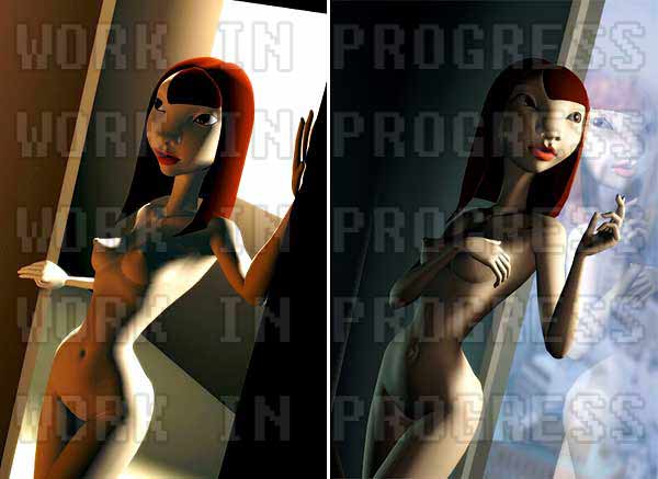
Working on a new pic. Trying out 2 different lighting / composition setups.
Which do you prefer? I can only choose 1, then ill work on the detailing. Its still very much a mock-up at the mo.
Im preferring the warm coloured one for composition and mood's sake.
Sorry for the watermark. I have my reasons, dammit!
A tribute of sorts to the finest site on the internet (NSFW)
slutsoft.tumblr.com/
(Which do you prefer? I can only choose 1, then ill work on the detailing. Its still very much a mock-up at the mo.
Im preferring the warm coloured one for composition and mood's sake.
Sorry for the watermark. I have my reasons, dammit!
A tribute of sorts to the finest site on the internet (NSFW)
slutsoft.tumblr.com/
Also she should have a sandwich or something, look at the size of her.
(looking at this?
(cant a lady be skinny and asian without being classed as a thai kiddy prostitute?
(just looks like some kid to me.
(Is that really just water?
(deux. that means two in foreign. I think.
(Right: post-coital
Quite hard to choose one as they both have their own merits. I'd want to see the right one finished. More intriguing
(Quite hard to choose one as they both have their own merits. I'd want to see the right one finished. More intriguing
The dark left side of the second picture is a bit empty. And her reflection has a massive blobby nose, but that may just be the S.
Which is the superior work?


(,
Sun 13 Sep 2009, 22:27,
archived)
Which is the superior work?
....cuz then I would vote here
(but that blob you speak of is indeed the 's'
Ta for the opinion. I do like the one on the right, but its not as tidy, composition wise, and the added detail of the reflected fingers catches the eye too much, whereas the white window on the first one draws the eye into her face area.
Err.... i mean COCK WANK TEH QUO HENRY LOL
(Ta for the opinion. I do like the one on the right, but its not as tidy, composition wise, and the added detail of the reflected fingers catches the eye too much, whereas the white window on the first one draws the eye into her face area.
Err.... i mean COCK WANK TEH QUO HENRY LOL
but with the constrasting orange interior light coming in from the left
(just needs the inside and outside light
(but it looked odd. Its meant to be an overcast day outside, maybe rain on the window. Bounce light from inside would be blue, gray or a bit green. I quite like nudey photography with cold colours - its different. Click 'older photos at the bottom once, and the one with the water in her hands is a good example:
(nsfw) slutsoft.tumblr.com/
((nsfw) slutsoft.tumblr.com/
:D
But seriously, outside blue, soft orange edge light from lamp out of shot
(But seriously, outside blue, soft orange edge light from lamp out of shot
I reckon it's a sunny day outside the bathroom.
(,
Sun 13 Sep 2009, 22:52,
archived)
I guess that adds an intriguing backstory.
(,
Sun 13 Sep 2009, 22:41,
archived)
not leaning languorously against a window.
(,
Sun 13 Sep 2009, 22:40,
archived)
and put some clothes on that child for goodness sake
(though i'm not sure i like the face (in either to be honest - it's less noticeable in the left one i guess)
(but thats the point. I wanted to give her a big nose, fat cheeks and see if she still has appeal.
Shes a sort of caricature based on these pics of this lady i saw:
wakarimasenlol.com/2009/08/02/gallery-doa-kasumi-cosplay-blue-costume/3091
(Shes a sort of caricature based on these pics of this lady i saw:
wakarimasenlol.com/2009/08/02/gallery-doa-kasumi-cosplay-blue-costume/3091
if you go for the second one - put a cigarette in her hand (it looks like she's holding one already anyway)
(I prefer the pose, & the colours are are a nice balance - in the left, the skin tones are too close to the background
very WOO, btw!
(very WOO, btw!
It's a font I probably wouldn't use myself.
(its actually a good watermark font because those jagged edges stand out a lot, and they would be a bastard to clone out or smudge into the image.
(I don't even know how you make the nose
(