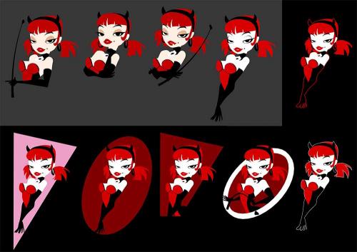
Which one of these is nicerest? Its a minimalised version of my 'main' character for use as a logo and Tshirt. It needs to work on a black background, and has to have a nice, readable sihlouette.
I likes the one with the pink triangle, but im worried she could look like one of Pedro's short lady 'shops at first glance...
CFB
Click for bigger (57 kb)
(,
Sun 16 Jun 2013, 20:18,
archived)
I likes the one with the pink triangle, but im worried she could look like one of Pedro's short lady 'shops at first glance...
CFB

Click for bigger (57 kb)
then at a push 8 or 9
the ones with arms down do look like she has arms for legs/legs for arms, especially 10
I like the face/raised head in 2, but think 3 is the most empowered and saucy
(,
Sun 16 Jun 2013, 20:20,
archived)
the ones with arms down do look like she has arms for legs/legs for arms, especially 10
I like the face/raised head in 2, but think 3 is the most empowered and saucy
Plus, i prefer black, and Trixie's 'look' revolves around either black or lavender backgrounds, and im not wearing a lavender tshirt!
Bah - im fed up o' looking at it now! I do like how elegant and slinky the arm one looks, but yeah - legs innit. I dunno - ive seen a few characters do it before, and it didnt read as legs. Wasnt as minimal / solid as mine though.
I like 3, but solid black arms folded are hard to read. Im not gonna add reflection detail on her gloves - its all about sihlouettes and simplicity.
(,
Sun 16 Jun 2013, 20:24,
archived)
Bah - im fed up o' looking at it now! I do like how elegant and slinky the arm one looks, but yeah - legs innit. I dunno - ive seen a few characters do it before, and it didnt read as legs. Wasnt as minimal / solid as mine though.
I like 3, but solid black arms folded are hard to read. Im not gonna add reflection detail on her gloves - its all about sihlouettes and simplicity.
that'd stop it looking like legs
*edit -

(,
Sun 16 Jun 2013, 20:25,
archived)
*edit -

but i like the red boob shape balancing out the red of her hair.
I might just fuck it and order a Tshirt with the legarms just to see what the quality is like, and to give me something to wear for LFCC next month. No rush for mass production.
(,
Sun 16 Jun 2013, 20:29,
archived)
I might just fuck it and order a Tshirt with the legarms just to see what the quality is like, and to give me something to wear for LFCC next month. No rush for mass production.
Well, her outfit goes to black, not red around her hips, then white where her thighs are. Good idea though - ill have a tinker.
(,
Sun 16 Jun 2013, 20:30,
archived)
could even have a highlight on that arse cheek

(,
Sun 16 Jun 2013, 20:31,
archived)

They didnt give Bugs Bunny an extra ear just for the lunchboxes, did they?
(,
Sun 16 Jun 2013, 20:32,
archived)
Ive got it sorted anyway - im gonna draw a line to define them in potatoshop. If you can see it through the horrendous compression, its on the last one in the grey background on the upper row
(,
Sun 16 Jun 2013, 20:45,
archived)
but they are all great
(,
Sun 16 Jun 2013, 20:51,
archived)
Or top row, middle for other colours.
(,
Sun 16 Jun 2013, 20:53,
archived)
9 is nice too, but the circle seems a bit too bright.
4, 5, 6, 7 and 10 look like midget mermaids.
(,
Sun 16 Jun 2013, 21:27,
archived)
4, 5, 6, 7 and 10 look like midget mermaids.
(,
Sun 16 Jun 2013, 21:33,
archived)
Actually, I like the comi ng out of the white ring bestest
(,
Sun 16 Jun 2013, 21:40,
archived)
Im trying to make it work - ive added her arse like toasty suggested and its working - she doesnt look like a retarded midget mermaid anymore, as c@bbage suggested. 2, 3 and 9 with the crop are good, but not as easy to read or as 'elegant' as the one with her arms outstretched
Ta for all your feedbackses anyhoo!
(,
Sun 16 Jun 2013, 21:43,
archived)
Ta for all your feedbackses anyhoo!
second from right with the white circle, reduce the circle by 10% so that she breaks out of the edge.
also third from right, the odd door shape, let her hands break over the edge of the shape, as if she'd leaning out of a window.
use the red outline from the top row, first from right on the break out bit;s of the gloves.
(,
Sun 16 Jun 2013, 21:44,
archived)
also third from right, the odd door shape, let her hands break over the edge of the shape, as if she'd leaning out of a window.
use the red outline from the top row, first from right on the break out bit;s of the gloves.
Ill try that one. Not really sold on the circle / crop one though. Wanna go with more 80s / angular looking shapes for the border
(,
Sun 16 Jun 2013, 21:51,
archived)
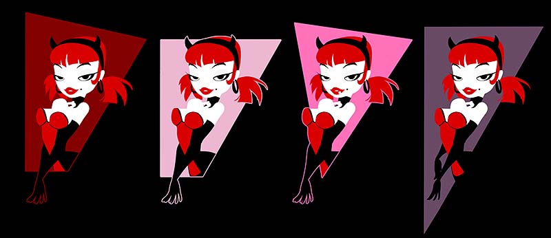
Went a bit mental with the 80's ness of some of the shapes and colours. The pink ones are badass!
(,
Sun 16 Jun 2013, 22:23,
archived)

Might go with 3, but perhaps tone the pink down a tad.
(,
Sun 16 Jun 2013, 22:36,
archived)
Which is why I prefer the one in the circle of the first set, as it makes it more obvious that it is just the upper body on a brief glimpse.
Though I do think the size and contrasting whiteness of the circle detract from the character a bit.
(,
Sun 16 Jun 2013, 22:51,
archived)
Though I do think the size and contrasting whiteness of the circle detract from the character a bit.
The circle doesnt really fit in that much, and i dont think the sihlouette is as strong, elegant or easily readable as the arm one.
Do you still think the arms look like legs now you can see her lower body on these ones?
(,
Sun 16 Jun 2013, 23:00,
archived)
Do you still think the arms look like legs now you can see her lower body on these ones?
(To my eyes.)
(,
Mon 17 Jun 2013, 1:39,
archived)
Yes, I know they're digital, but so is my method of expressing my love...
(,
Sun 16 Jun 2013, 21:58,
archived)
maybe change the red colour inside the circle so she stands out more
or summit
(,
Sun 16 Jun 2013, 21:59,
archived)
or summit

