 I'm desperately mocking up
Leaflets etc for a possible graphic design job. I aint got the foggiest really but was asked to supply examples of flyers and posters..? Does this look professional, if not what would you alter??

Cheers for any serious help :)
(,
Tue 25 Mar 2008, 21:01,
archived)
Cheers for any serious help :)
It's not too bad down to, say the Y in Spatula Andy. LordManley twitter.com/LordManley,
Tue 25 Mar 2008, 21:07,
archived)
Proper constructive dismissal, you say?
The Malfunction and the Spatula Andy are okay fonts, but in the main you have splattered too many fonts onto a dreary and mottled and slightly DPM background.
You need the fonts to stand out more and perhaps to use fewer fonts (fonts are not cool in themselves if you do not make them yourself).
This looks like a lot of fliers I see about, but it is just text on an image and I would have to say that it lacked for professional design.
I am being very harsh here, but you did ask for honesty. I am willing to lie if that is preferable?
(You need the fonts to stand out more and perhaps to use fewer fonts (fonts are not cool in themselves if you do not make them yourself).
This looks like a lot of fliers I see about, but it is just text on an image and I would have to say that it lacked for professional design.
I am being very harsh here, but you did ask for honesty. I am willing to lie if that is preferable?
LordManley twitter.com/LordManley,
Tue 25 Mar 2008, 21:06,
archived)
Much appreciatedI feed off your type of comment, its all good!
(,
Tue 25 Mar 2008, 21:08,
archived)
PersonallyI would desaturate the bg a little and make the text other than the title all one font.
EDIT also, perhaps take away the coloured outlines on text. for example, the venue info could easily be just white text a little smaller so it would stand out in colour but not take away from the band names
(EDIT also, perhaps take away the coloured outlines on text. for example, the venue info could easily be just white text a little smaller so it would stand out in colour but not take away from the band names
 thiswasmyclone,
Tue 25 Mar 2008, 21:04,
archived)
re your edit, i like the look of the 'indie night live music featuring' bit
and i think that fucked up cooper type font is great, and in that instance ifeel the outline works
although the drop shadow and outer glow can fuck right off
(although the drop shadow and outer glow can fuck right off
 mictoboy shitting in your cunt since,
Tue 25 Mar 2008, 21:08,
archived)
yeah
I was refering specifically to the last line about the venue. I wasn't very clear.
( thiswasmyclone,
Tue 25 Mar 2008, 21:09,
archived)
I'm not sure about the emboss on Malfunction.It looks like it's smeared and scratched- to me giving that depth makes no sense.
That could just be me though.
(That could just be me though.
 Kamikaze Stoat £4.09,
Tue 25 Mar 2008, 21:12,
archived)
less fonts
things alway look fucking rubbish if you use more than, say, 3 fonts
what thiswasmyclone* said too
it looks like you just went for the most interesting looking fonts and colours, rather than deciding on an overall look
make it readable, decide on a layout, and choose a colour scheme
maybe sketch a few ideas out on paper first
(what thiswasmyclone* said too
it looks like you just went for the most interesting looking fonts and colours, rather than deciding on an overall look
make it readable, decide on a layout, and choose a colour scheme
maybe sketch a few ideas out on paper first
mictoboy shitting in your cunt since,
Tue 25 Mar 2008, 21:04,
archived)
it does the jobwouldn't win awards, but wouldn't look out of place on the floor in the entrance to Fopp.
If you're trying to get a job at a decent design company then you probably should have done your research first. Or at least know what you like and how to express it.
(If you're trying to get a job at a decent design company then you probably should have done your research first. Or at least know what you like and how to express it.
 HappyToast Groat froth,
Tue 25 Mar 2008, 21:04,
archived)
Oh,
and i don't know how professional it is to say spazz on a flyer. I know there's no doubt a band called something like that out there, but it's not very PR friendly.
( The Ropewalker,
Tue 25 Mar 2008, 21:06,
archived)
I thought he meant it was for a one-off
ie. someone asked him to mock up a design. But you're right, if it's for a proper job and the band name is made up then it would have to be flawless design before you start inserting that level of homour
( thiswasmyclone,
Tue 25 Mar 2008, 21:07,
archived)
sorry if this sounds nastybut i think that a record background is a bit stereotypical,
if i was any good at anything i would suggest something else
but im not, sorry, but i still think it looks good!
(if i was any good at anything i would suggest something else
but im not, sorry, but i still think it looks good!
 Nathanial Hornblower,
Tue 25 Mar 2008, 21:06,
archived)
nah
its all constructive! ive got 3 days to come up with stuff so im taking all the notes i can :)
(,
Tue 25 Mar 2008, 21:07,
archived)
too many typefaces Pasanonic 's been known to cause insanity in laboratory mice,
Tue 25 Mar 2008, 21:07,
archived)
make it photocopy friendly...convert it to greyscale and have a look... (all the promoters use b/w pictures... saves a shitload of cash when you make 1000+ copies)
(,
Tue 25 Mar 2008, 21:07,
archived)
I'll do it for you - I'm a web designer.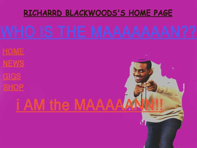
 kinks rock over London, rock on Chicago,
Tue 25 Mar 2008, 21:07,
archived)
I'm clicking on this...but it don't work.
You must feel QUITE the fool right now.
( (|D[ekionplexis B3ta.com: fictional child porn is OK,
Tue 25 Mar 2008, 21:12,
archived)
Shit biscuits.I spent fucking hours on that.
( kinks rock over London, rock on Chicago,
Tue 25 Mar 2008, 21:15,
archived)
I was picking my nose as I reached this imageone snort later my hand is covered in snot. Thanks.
( kingofpork is the king of pork,
Tue 25 Mar 2008, 21:18,
archived)
The point of this picture is
to remind you of the coolness of Britain's Will Smith, not to help you evacuate your sinuses.
( kinks rock over London, rock on Chicago,
Tue 25 Mar 2008, 21:22,
archived)
Too many fontsmany of which aren't easy to read at a distance.
Difference clouds? DIFFERENCE CLOUDS? You'll be laughed out the building.
Take a look at designs for festival line ups and take some inspiration from there. Use Malfunction as the main idea, i.e. broken items etc rather than some vinyl. Try this: images.google.co.uk/images?source=ig&hl=en&rlz=&q=gig+flyer&um=1&ie=UTF-8&sa=N&tab=wi
(Difference clouds? DIFFERENCE CLOUDS? You'll be laughed out the building.
Take a look at designs for festival line ups and take some inspiration from there. Use Malfunction as the main idea, i.e. broken items etc rather than some vinyl. Try this: images.google.co.uk/images?source=ig&hl=en&rlz=&q=gig+flyer&um=1&ie=UTF-8&sa=N&tab=wi
 magnum,
Tue 25 Mar 2008, 21:08,
archived)
Haha
I am ashamed of my difference clouds now, Ive never felt that feeling in my life before
(,
Tue 25 Mar 2008, 21:11,
archived)
if you use anythingout of the photoshop box which includes filters and fonts, the design industry will wonder why you are wasting their time.
( Pasanonic 's been known to cause insanity in laboratory mice,
Tue 25 Mar 2008, 21:12,
archived)
At least it's not lens flarebut an obvious filter is a bad filter in my opinion.
( magnum,
Tue 25 Mar 2008, 21:13,
archived)
Needs a hot sweaty girl with big tits. (|D[ekionplexis B3ta.com: fictional child porn is OK,
Tue 25 Mar 2008, 21:09,
archived)
the component parts seem ok for a flyerbut the venue needs to be a bit clearer, as that will be the eventual client.
what kind of job, junior designer?
(what kind of job, junior designer?
Thor_sonofodin has done things, terrible things on,
Tue 25 Mar 2008, 21:09,
archived)
Are these the fonts that the bands themselves use?Else change 'em to a single one.
Also the background isn't sufficiently contrasting with the text-- it harldy jumps out at you. As it seems everyone else is saying these things too, I'll return to lurking for the moment! : )
Edit: On the plus side, I like what you did with the text at the top, and it does look like almost every other flyer like that out there (there are pros and cons to that...).
(Also the background isn't sufficiently contrasting with the text-- it harldy jumps out at you. As it seems everyone else is saying these things too, I'll return to lurking for the moment! : )
Edit: On the plus side, I like what you did with the text at the top, and it does look like almost every other flyer like that out there (there are pros and cons to that...).
 drunkenoaf,
Tue 25 Mar 2008, 21:09,
archived)
I would change the record in the background
for something which you don't notice at first but turns out to be very surprising.
And make it landscape.
(And make it landscape.
 Afinkawan est in horto, sedet,
Tue 25 Mar 2008, 21:10,
archived)
margins
give it 5mm margin all round.
It gives the printer a fighting chance of not trimming a letter orf.
(,
Tue 25 Mar 2008, 21:12,
archived)
It gives the printer a fighting chance of not trimming a letter orf.
Looks just rightfor a malfunction . . . I like it . . . but would still heed some of the advice . . .
( Valin I changed glasses while I wasn't looking,
Tue 25 Mar 2008, 21:13,
archived)
I reckon
you should leave it as is, pretend it's real, and tell them that your client specifically requested an eye-melting neon Nu-Rave look or something. Then start again on something else completely different using everyone's advice in this thread.
(,
Tue 25 Mar 2008, 21:18,
archived)
you don't have a foggiest about what?If you don't have the foggiest do you think they will?
too many fonts used...and they're not that legible
it doesn't give me a feel of what the night will be like.
put your own mark on it...it looks like a thousand other flyers that are churned out without a thought about what the night is about.
it looks crowded..and center the text
or talk a lot of shite and blag your way into it...good luck
and look at other styles of flyers for inspiration...but don't rip them off ;)
[Gig Flyers]
(too many fonts used...and they're not that legible
it doesn't give me a feel of what the night will be like.
put your own mark on it...it looks like a thousand other flyers that are churned out without a thought about what the night is about.
it looks crowded..and center the text
or talk a lot of shite and blag your way into it...good luck
and look at other styles of flyers for inspiration...but don't rip them off ;)
[Gig Flyers]
 prodigy69 My brain has too many tabs open,
Tue 25 Mar 2008, 21:18,
archived)
Can I recommend looking at...
www.theserif.net
It's basically daily updates of design portfolios and bits they like. I'm quite new to the whole graphic design thing and I've found it really useful in terms of seeing what other people are doing.
I'd agree with the fewer fonts things on your flyer and I'd also suggest thinking about heirarchy in that my eye doesn't naturally follow the text down the flyer.
(,
Tue 25 Mar 2008, 21:19,
archived)
It's basically daily updates of design portfolios and bits they like. I'm quite new to the whole graphic design thing and I've found it really useful in terms of seeing what other people are doing.
I'd agree with the fewer fonts things on your flyer and I'd also suggest thinking about heirarchy in that my eye doesn't naturally follow the text down the flyer.
What everyone else saidbut I also feel there are a few too many colours. And if you're going for a busy background then I'd stick to simpler fonts. This looks way too busy.
( SugarSpunSister Yeah, whatever,
Tue 25 Mar 2008, 21:29,
archived)
Don't just limit the number of fonts
Change the size, also. I would make "Malfunction" larger and put "indie night" closer to it, as if it were part of the logo (possibly right underneath "Malfunction" and to the right). Make the outline of "indie night" match the colors in "Malfunction" to make it seem like one piece --a logo.
Put "live music featuring" closer to the band names, and make the names/logos smaller.
I think the time and date should be closer to each other.
Remember the four basic rules of design and layout:
Contrast
Repetition
Allignment
Proximity
(,
Tue 25 Mar 2008, 21:56,
archived)
Put "live music featuring" closer to the band names, and make the names/logos smaller.
I think the time and date should be closer to each other.
Remember the four basic rules of design and layout:
Contrast
Repetition
Allignment
Proximity